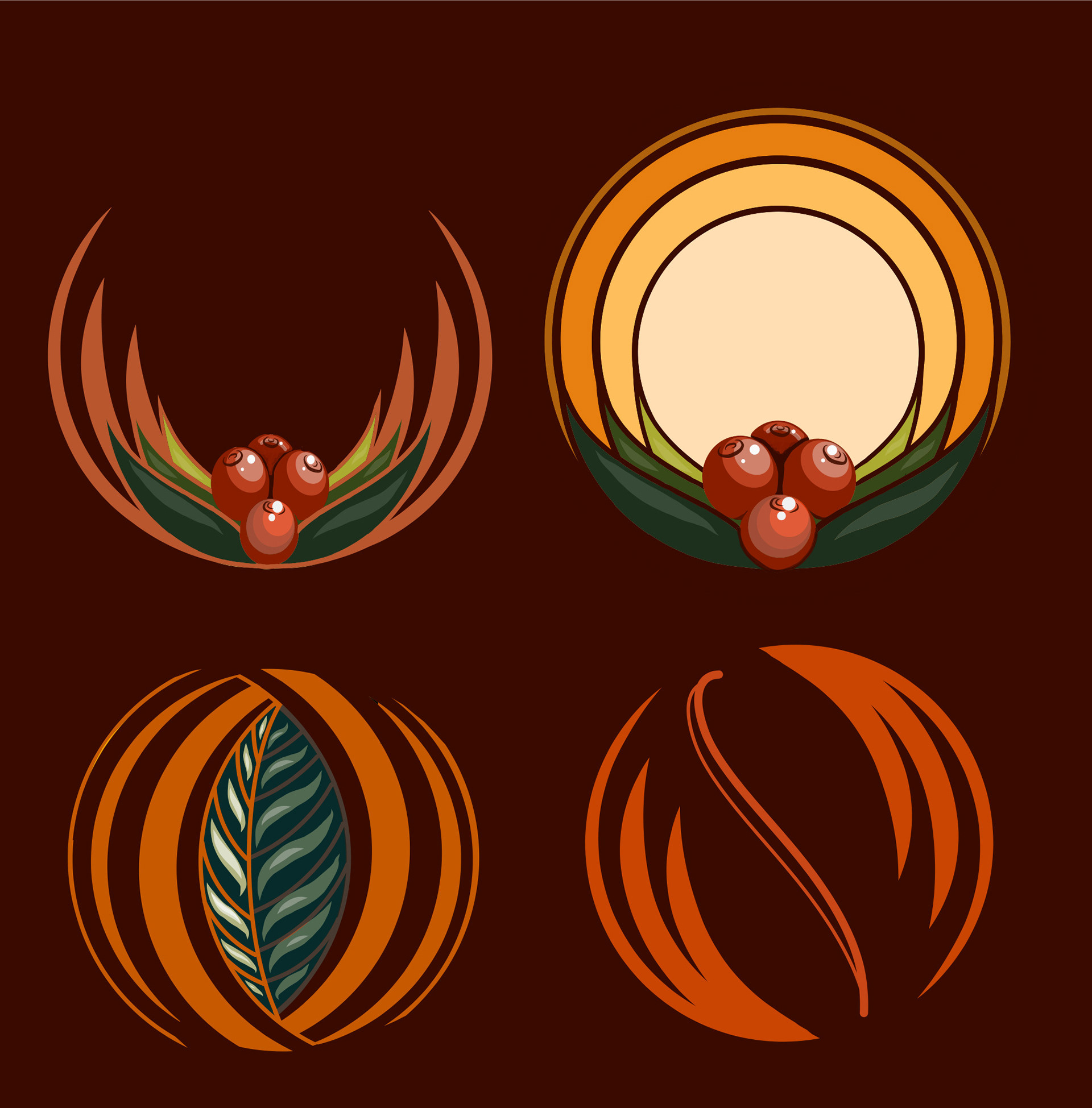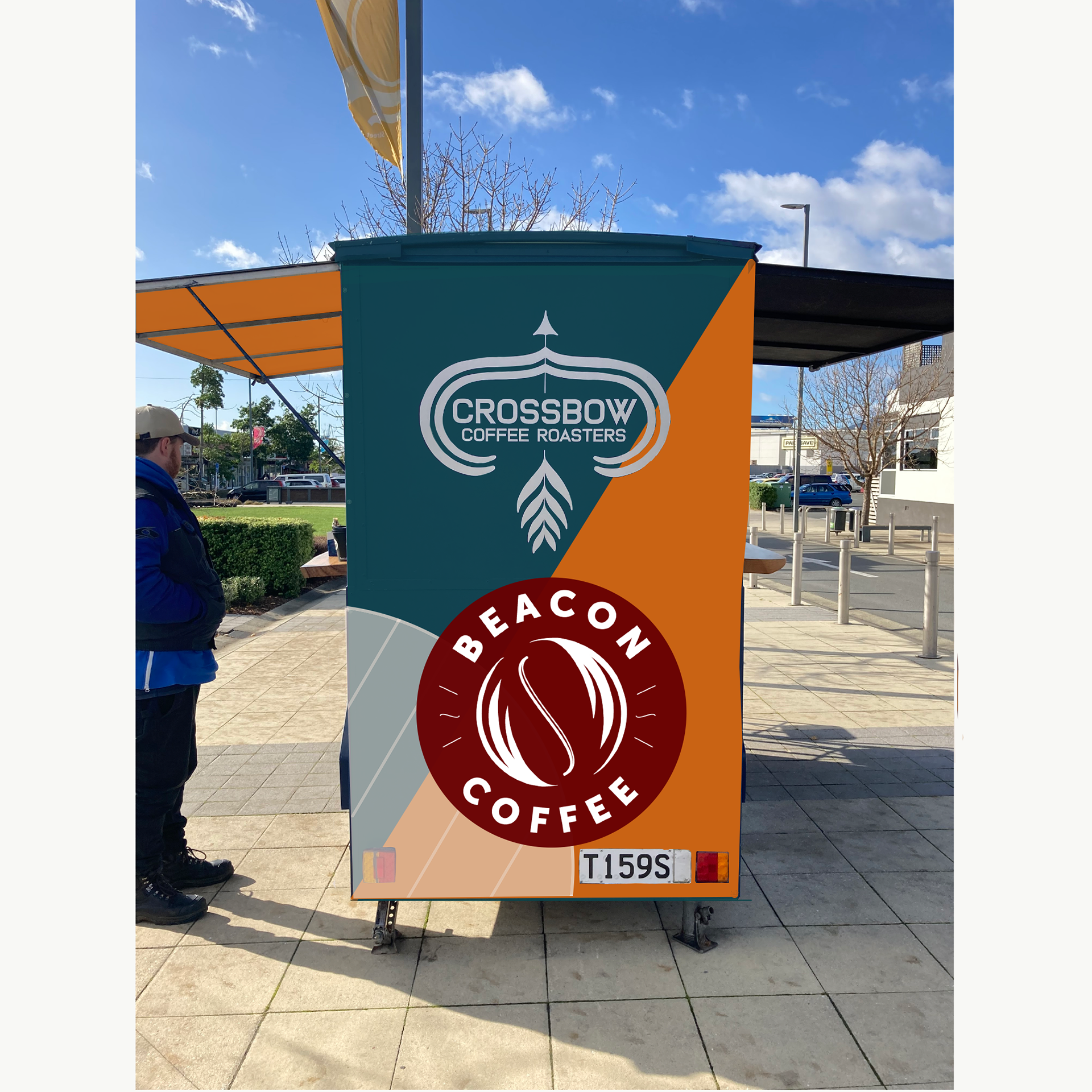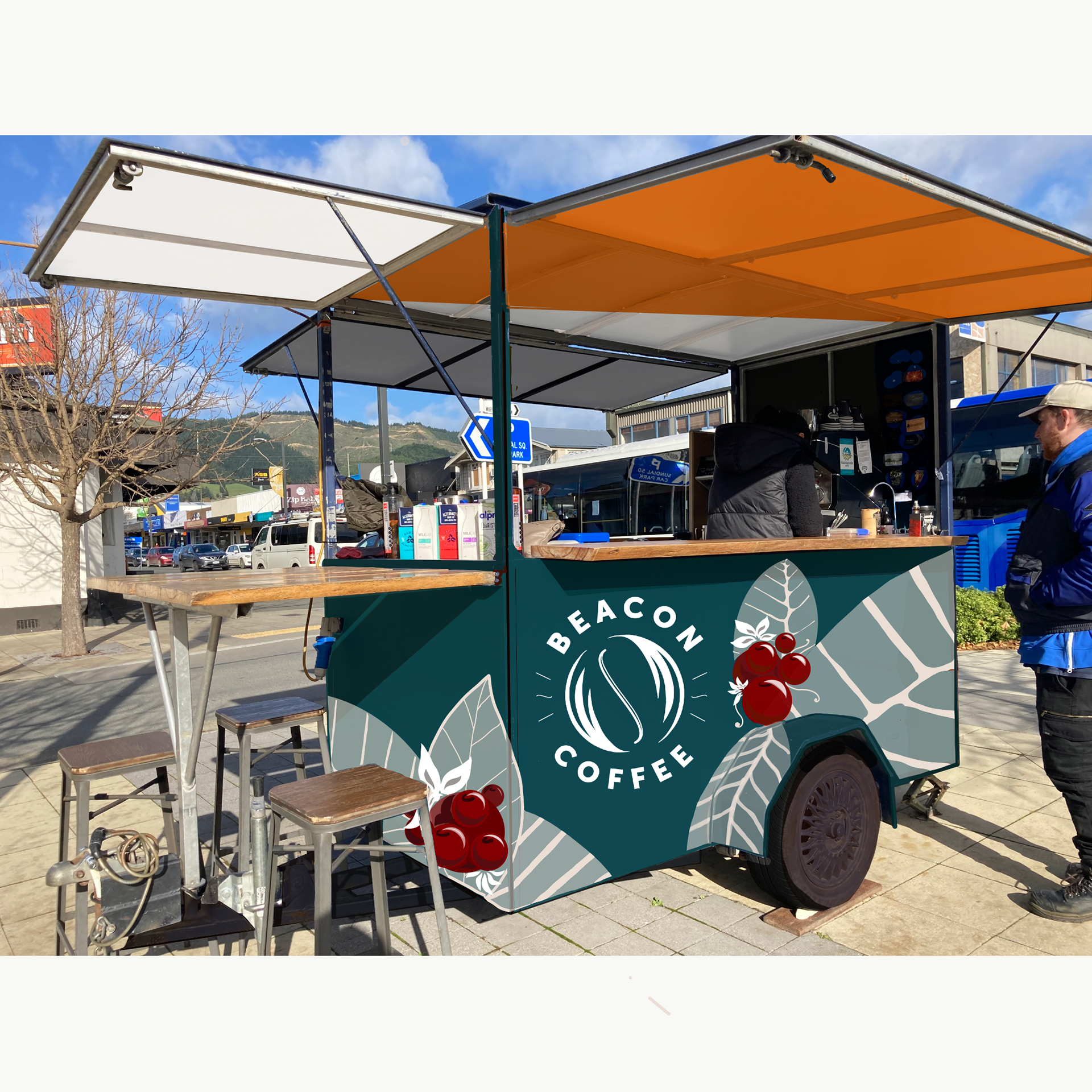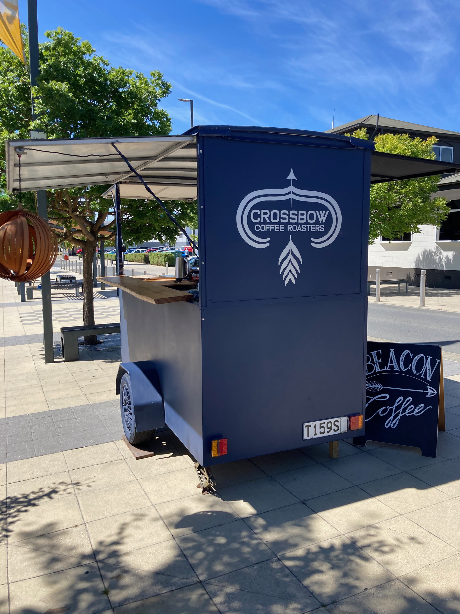
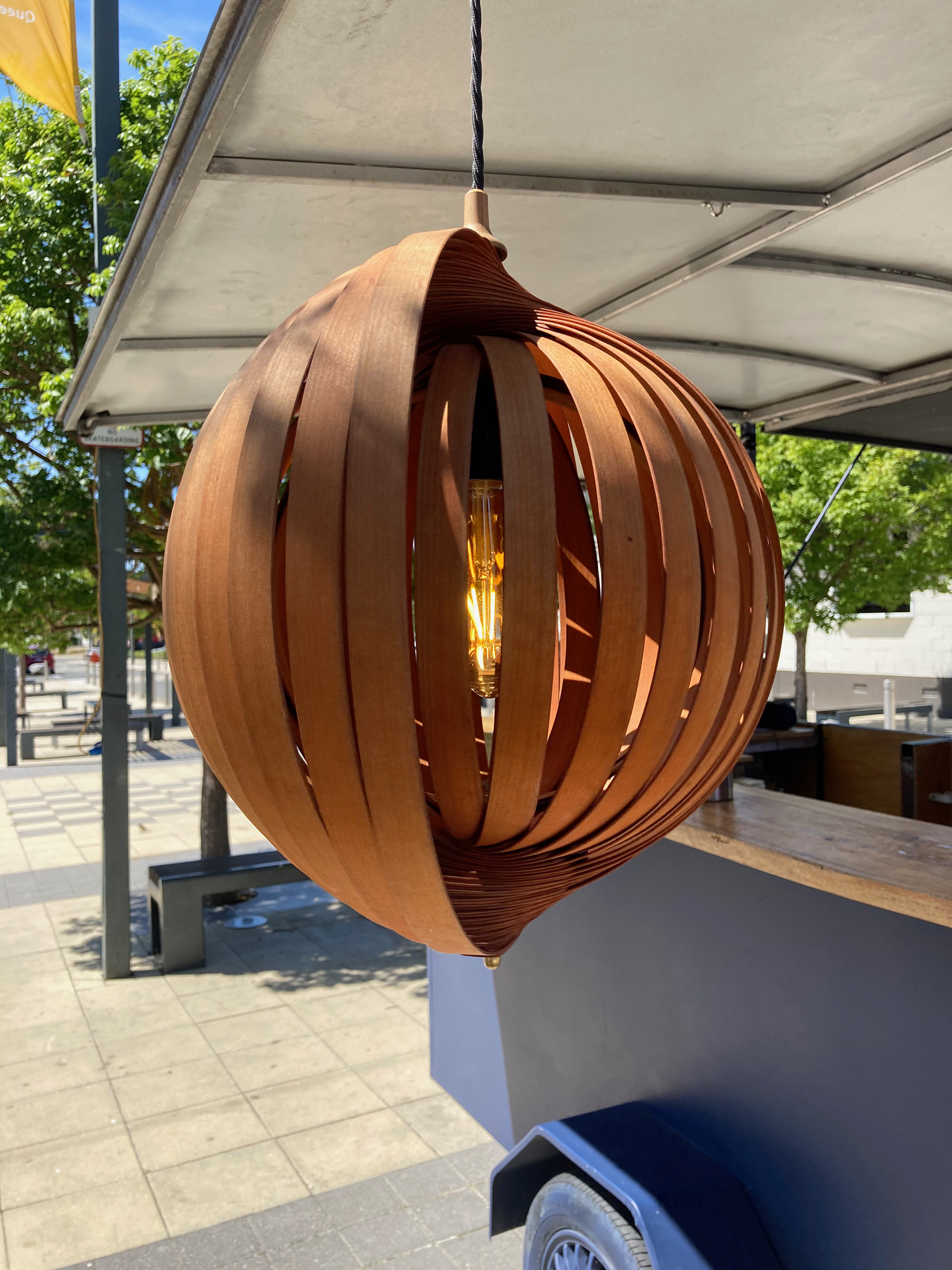
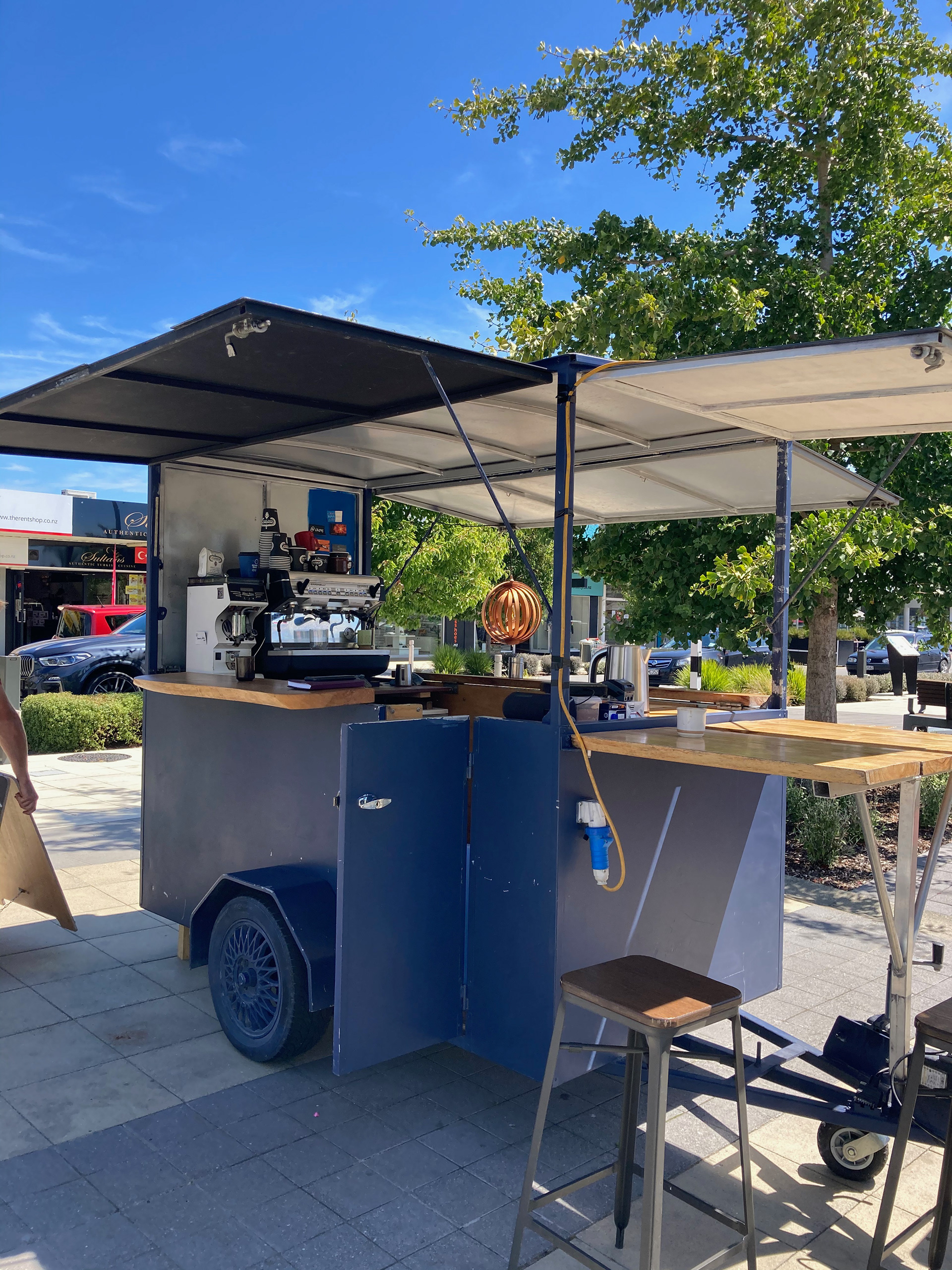
Sam (the owner) had this signature light feature by a local craftsman that he wanted to incorporate into the design. He also requested a handpainted sign for the side of the cart and was open to repainting the cart for the branding.
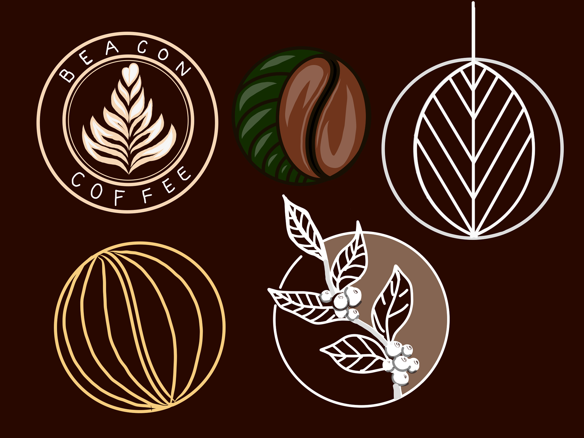
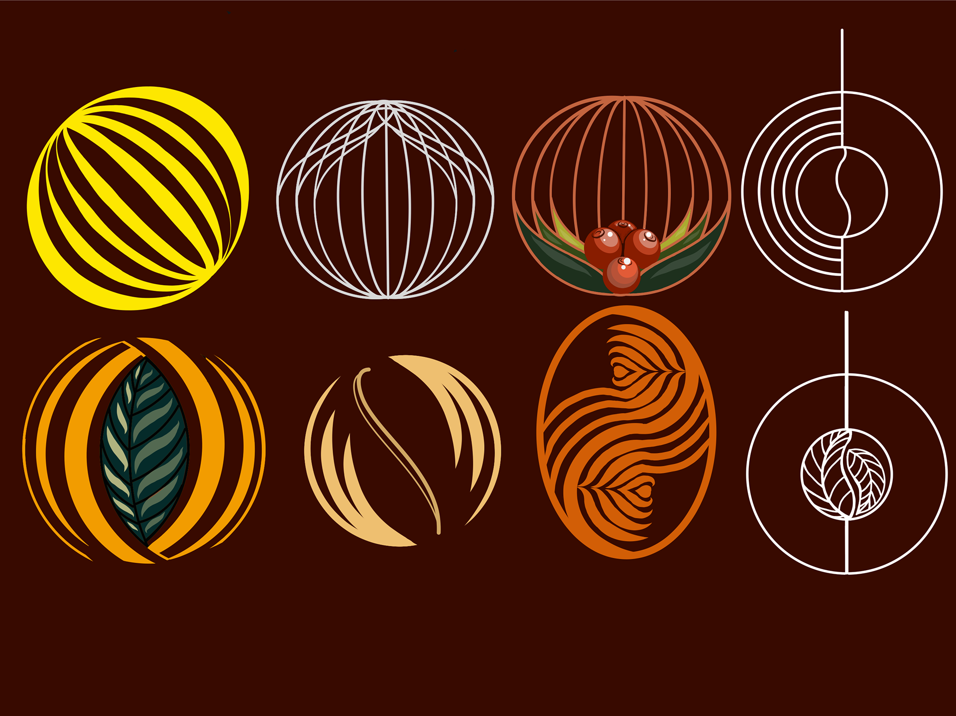
Through the research and development phase I used Procreate to sketch out logo ideas using the lateral lines as a core design element. I experimented incorporating latte art into the light motif but ultimately the one that the client liked out of these options was the bean sphere (bottom right first image). I also generated mock ups for the repaint of the cart using earthy complimentary colours that would help it stand out.
